A Landing Page is the first page that visitors will see of your website after clicking on your banner, ad or newsletter. This could be a specific page on your website or a separate page created exclusively for search engines.
Its purpose is to encourage them to take a specific action, such as making a purchase, or registering on your platform. Its effectiveness will therefore determine the success of your marketing campaign, and in particular its conversion rate.
In this article, we will start with the basics, namely the rules that your Landing Page must follow to give you the results you expect.
What is the purpose of a Landing Page?
The goal of a good Landing Page is to generate leads and increase your conversion rate in order to achieve your marketing or business goals. As we just have seen, this can be your home page, or a separate page created for a campaign or the promotion of a specific product.
In reality, it’s all going to depend on how your future visitors find your Landing Page, and why you created it for them. Most often, Internet users will come across your home page through word of mouth, or social networks. But your Landing Page is normally accessible in a more organic way, following a search on an engine.
A landing page is usually promoted through Google Adwords or another similar service. And it only exists to meet one goal: to convert!

However, the advantages that a Landing Page can offer you are numerous: Beyond generating leads and converting them into users, it can:
- increase your SEO ranking: a landing page is designed to target certain keywords and promoted via Google Adwords. It is therefore intended to make your site climb in the search results;
- Promote a product you are about to launch: Sometimes your landing page will not be part of your site’s taxonomy. It will exist only to convey a commercial or marketing message. A landing page with a high conversion rate will simply act as a portal to guide visitors through your sales funnel. Rather than finding your CTA on your home page or footer, it will be accessible on the Landing Page, and will make it easier for them to subscribe, register or buy.
The rules to follow to create a Landing Page that increases your conversion rate
No matter what tool you are going to use to create your Landing Page, it must follow certain rules to help you get the most conversions possible.
1. The simpler, the better!
Don’t waste time looking for an innovative design to create your landing page. Instead, look for a template that already has the space reserved for the information your visitors expect to find. This will not only save you time, and get a minimalist page, but devilishly efficient!
2. Attract the attention of visitors
Your Landing Page should also be catchy enough to grab the attention of your leads. Also, make sure it’s responsive, so they can have the smoothest experience possible, no matter what device they’re using. Use royalty-free and compressed images to make your landing page load time fast.
3. Find an effective CTA
Any good Landing Page will have a call-to-action button that will draw the visitor in, and make it clear to them what their interest is in signing up / buying your product. For example, you can encourage him or her to do so by offering a free trial, or a useful ebook. The key is to offer something that he/she may be interested in in exchange for sharing his information.
4. Be prepared to easily collect data
The main goal of a Landing Page (and inbound Marketing in general) is to capture your customer data, and to have a way to track your leads. Your landing page must therefore include a web form in which the visitor can indicate his name, first name, email address, telephone number, and all the information you deem useful (to get in touch with him later, or better understand his needs).
Keep it simple in creating your registration form. If it is too long, your conversion rate will generally be low. Your visitors may indeed be wary if you are too greedy for information.
5. Think carefully about the integration of your Landing Page
If you’re using a dedicated builder to build your Landing Page, make sure it can sync with your CRM or Inbound Marketing software. This will make it much easier for you to follow up on your prospects and consolidate customer data.
Also consider the possibilities offered in terms of domain and personalized messaging. Custom domains can help improve your SEO rankings, as can messaging which can increase your conversion rate.
6. Test and repeat!
There are many tools on the market to help you test your landing page’s effectiveness in generating leads. Create two versions of your landing page and test which one will have the biggest impact on your visitors. Experiment with different layouts, CTAs, colors, and even images.
Landing Page examples to draw inspiration from
And because pictures speak louder than words, we wanted to end this article with examples of Landing Pages that have been proven to work.
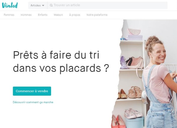
We start with Vinted, which created an ultra efficient landing page thanks to:

- its title which immediately raises the problem encountered by its users;
- a good CTA that shows how easy it is to sell on the app;
- an image that humanizes the service, and illustrates the advantages offered by Vinted (the happiness of doing good business);
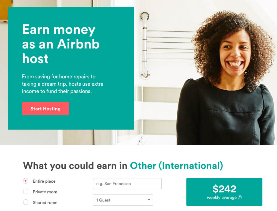
Another great example that you can use as inspiration for your Landing Page is Airbnb. Why ?

- The benefit that users can derive is well highlighted;
- The visitor is encouraged to complete the form to estimate his future earnings:
- The CTA is doubled to increase the conversion rate.
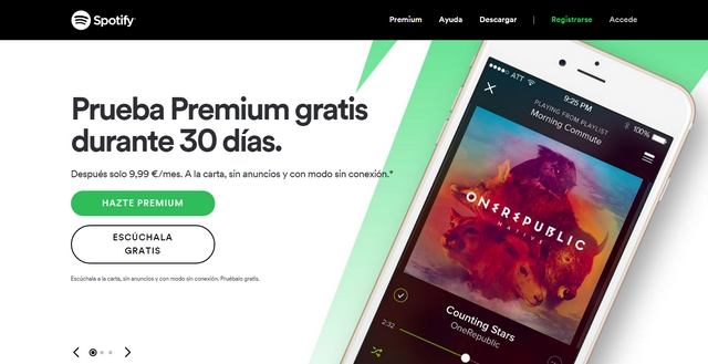
Finally, you can also take the example of the Landing Page of Spotify which:

- Present directly in its title the offer of 3 free months:
- Creates a sense of urgency (since the offer ends on a specific date);
- Gives the visitor the feeling of having a choice (since he can choose the free plan and does not have to take the Premium pack).
Want to create an impactful Landing Page to boost a new product or service? Find out how Startups.camp can help you!